Workflow Builder pricing – free Community, EUR 6,990 Enterprise
Two paths to ship a workflow editor in your product: build it yourself with our React SDK (free Community or EUR 6,990 Enterprise), or have the Workflow Builder team ship it with you. No subscriptions, no per-seat fees, no annual renewals - just a one-time license and optional partner-led delivery.


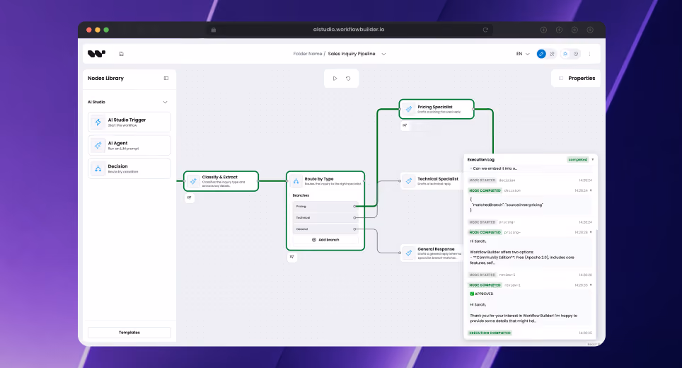
How do you want to ship?
Two paths. Four options.
Whether your engineering team ships with our React SDK, or our team ships it with you - here are the explicit options.
Build it yourself
Engineering team + our React SDK
Community Edition
EUR 0
Apache 2.0, free forever, commercial use OK

Visual workflow editor (React SDK on NPM)
Reference back-end (engine-agnostic HTTP API)
Temporal integration adapter
Three port interfaces (WorkflowEnginePort, ActivityRunnerPort, EventEmitterPort)
Full source on github.com/synergycodes/workflowbuilder
Community support (GitHub issues)
Enterprise Edition
EUR 6,990
One-time, perpetual license per organization
Everything in Community Edition
Source code access to Enterprise-only components
Flow Runner plugin (graph traversal helper)
Figma Kit (matched design tokens + components for design teams)
Advanced canvas plugins (ELK auto-layout, smart edge routing, edge reshaping)
Priority GitHub issues
Enterprise SLA available on-demand - contact sales, terms negotiated individually

PATH B options layer on top of an Enterprise Edition license (EUR 6,990).
Our team works in the same codebase as you, with full source access. Community-only customers can self-serve; partner-led work starts with Enterprise.
Build it with us
Enterprise Edition + partner-led services from the team that built the React SDK
▲ Requires Enterprise Edition
Workflow Setup Sprint
EUR 15,000-25,000
2-4 week sprint · on top of Enterprise license (EUR 6,990)
1-day discovery workshop with your team
Architecture review (your stack + WB integration)
AI dev environment setup (Claude skills, scaffold tools)
Integration plan with your back-end
Transfer to your team (we hand it over)
30-day post-handover support
▲ Requires Enterprise Edition
End-to-end services
EUR 50-200k+
On top of Enterprise license · talk to the team for an estimate
Phase 1 discovery and architecture
Full implementation with our engineering team
Custom node libraries, back-end integration, theming
Workflow Builder team owns delivery until production
15 years of workflow product engineering experience
200+ workflow products delivered since 2011
Features across all plans
What you get in Community vs Enterprise
Community Edition is a complete, production-ready workflow editor stack - free under Apache 2.0. Enterprise adds advanced canvas plugins, design tooling, and premium support on top.
Both editions are perpetual. No subscription, no per-seat fees, no annual renewal for the license itself.
Cost vs alternatives
What you would pay elsewhere for a comparable embed workflow editor
Same category, different pricing models. Most workflow editor stacks charge per-seat (commercial libraries) or per-workspace yearly (automation platforms). Workflow Builder Enterprise is a one-time perpetual license, unlimited developers.
EUR 0 license + 14-25 engineer-weeks (~EUR 50-100k of dev time)
EUR 6,990 one-time · perpetual · unlimited developers
Same category, 3-20x lower lifetime cost. Same delivery quality - BMW, Siemens, Canon, 200+ workflow products since 2011.
Vendor prices as of 2026-05. Each vendor's license terms are subject to change - see our license comparison for full citations.
Not sure yet?
Two demos. Two questions answered.
Full three-block stack
Run a workflow end-to-end
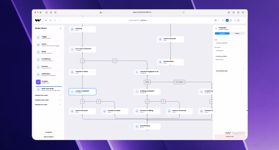
Shows the full three-block stack in action: editor, reference back-end, Temporal worker.
What runs

Editor

Reference back-end

Temporal worker
CASE STUDIES
Pricing FAQ
Questions teams ask before they buy
- Is Workflow Builder the same as Builder.io?
No. Builder.io is a visual page builder for marketing sites. Workflow Builder is a React SDK for embedding production workflow editors into B2B SaaS products. Different category, different buyer, different problem.
- What is included in the Enterprise license?
EUR 6,990 one-time gets you source code access to Enterprise-only components (Flow Runner plugin, Figma Kit, advanced canvas plugins: ELK auto-layout, smart edge routing, edge reshaping) and priority GitHub issues. Community Edition (Apache 2.0) already includes the visual workflow editor, reference back-end, and Temporal adapter, so you do not need Enterprise to ship a working workflow product.
- Is the reference back-end gated behind Enterprise?
No. The reference back-end is part of Community Edition. Apache 2.0 license, full source on GitHub, including the Temporal integration adapter. Enterprise adds Enterprise-only components on top - Flow Runner plugin, Figma Kit, dedicated support. See what is in the reference stack →
- Can I use Workflow Builder Community in a commercial product?
Yes. Apache 2.0 is a liberal license. Commercial use is OK, modification is OK, no copyleft. You can build and sell a product on top of Workflow Builder Community Edition without a commercial license. See the open source story →
- Is the EUR 6,990 a subscription or one-time?
One-time, per organization, unlimited developers. Perpetual license to use the Enterprise components in your products. No annual renewal required.
- Do I have to use Temporal?
No. Temporal is the reference engine adapter shipped today. You can swap it for Inngest, Camunda, AWS Step Functions, Cloudflare Workflows, or your own in-house engine using the same port interfaces (WorkflowEnginePort, ActivityRunnerPort, EventEmitterPort). See engine integrations →
- What is the Workflow Setup Sprint?
A 2-4 week kickoff sprint that pairs you with our engineering team. Architecture review, AI dev environment setup with Claude skills and scaffolding tools, integration plan with your back-end, transfer to your team, plus 30 days of post-handover support. EUR 15,000 to EUR 25,000 depending on scope. Requires an Enterprise Edition license (EUR 6,990), so our team works in the same codebase as you with full source access.
- Do I need Enterprise Edition for the Workflow Setup Sprint or End-to-end services?
Yes. Both partner-led options require an Enterprise Edition license (EUR 6,990 one-time). The Enterprise license unlocks source code access to the components our team works with: Flow Runner plugin, Figma Kit, advanced canvas plugins. Community Edition (Apache 2.0) is self-serve; partner-led delivery starts at Enterprise. Either way, the Enterprise license is yours perpetually, even after the engagement ends.
- Do you offer an Enterprise SLA?
Yes, on-demand. Enterprise SLA is available for Enterprise Edition customers, so contact sales to discuss your specific requirements. Terms (response times, escalation paths, coverage hours) are negotiated individually based on your team size, deployment scale, and operational needs.
- Will Apache 2.0 ever change to BSL or SSPL?
No. Apache 2.0 is our hard commit. We watched the MongoDB SSPL, Elastic SSPL, HashiCorp BSL, and Redis SAL relicensing events. Workflow Builder Community Edition stays Apache 2.0. The full source on GitHub is yours under that license, perpetually.