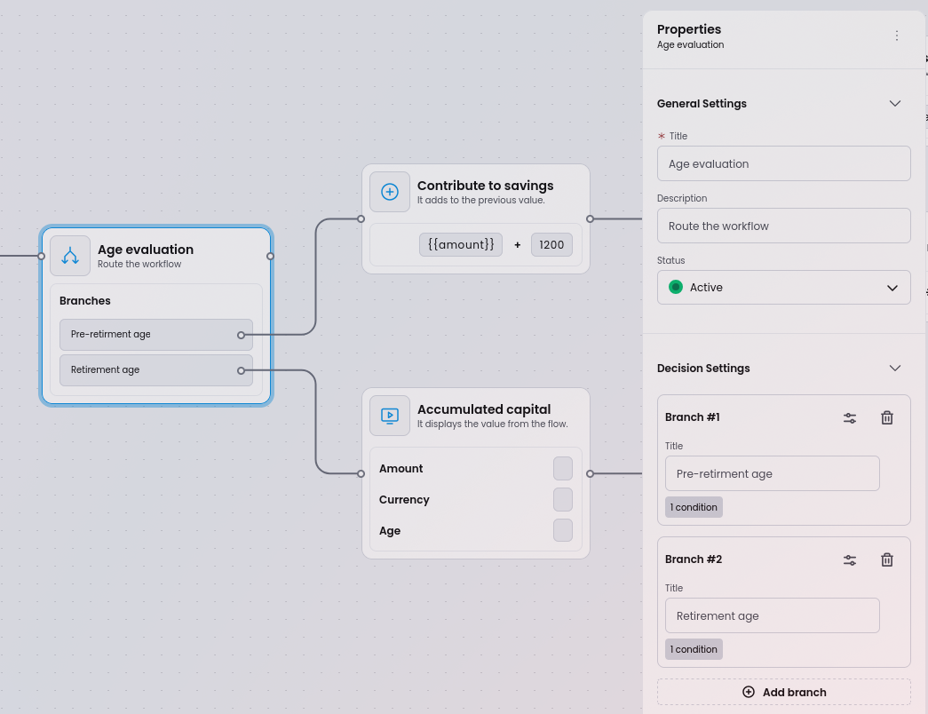
Properties Sidebar
When a node or edge is selected on the canvas, the properties panel opens on the right. It renders a form for that element’s configuration fields.
Schema-driven forms
Section titled “Schema-driven forms”Every node type defines its properties using JSON Schema. Workflow Builder uses JSONForms to turn that schema into a rendered form automatically - no custom form code required.
Adding, removing, or changing a property is a matter of editing the schema file. The properties panel updates immediately.
properties: { label: { type: 'string', }, description: { type: 'string', },}For complete examples, see the node schema definitions in the source repository. Each node type has a schema.ts (JSON Schema) and uischema.ts (UI Schema) file.
Supported field types
Section titled “Supported field types”| Field type | Schema type | Description |
|---|---|---|
| Text input | { type: 'string' } | Single-line string field. Use format: 'textarea' in UI Schema for multi-line |
| Dropdown | { type: 'string', enum: [...] } | Select from a predefined list of options |
| Checkbox | { type: 'boolean' } | Boolean toggle |
| Numeric | { type: 'number' } or { type: 'integer' } | Number input with optional minimum/maximum constraints |
| Date / Time picker | { type: 'string', format: 'date' } | Date and time selection |
| Rich text editor | { type: 'string' } with UI Schema control | WYSIWYG editor for formatted content |
| Accordion | UI Schema layout | Collapsible group of related fields using GroupLayout in UI Schema |
For a comprehensive guide on all available controls, layouts, and how to create custom renderers, see the form generation guide in the source repository.
Validation
Section titled “Validation”JSON Schema validation rules (such as required, minLength, pattern, and minimum/maximum) are supported. The properties panel validates input and shows error messages automatically.
Dynamic rules
Section titled “Dynamic rules”The UI Schema supports conditional visibility rules. Fields can be shown or hidden based on the value of another field:
// Show 'timeSchedule' only when type === 'timeBasedTrigger'rule: { effect: 'SHOW', condition: { scope: '#/properties/type', schema: { const: 'timeBasedTrigger' }, },}This keeps the form focused and avoids overwhelming users with irrelevant fields.
Edge properties
Section titled “Edge properties”Edges (connections between nodes) also support properties. When an edge is selected, the panel shows:
- Label - optional visible text on the connection line
- Label visibility toggle
Labels are draggable directly on the canvas for precise placement.